Case study 01

OVIO

Branding der smager af mere

OVIO is a branding and digital concept built for restaurants and eateries that deliver great food but haven't found a visual voice to match it. The project pairs brand strategy with a responsive website, translating quality you can taste into a brand you remember.

Team
Solo project
Role
Visual identity designer
Brand guideline designer
Web designer
Subject
Branding, identity, web design
Year
2026

Tools used:

  • Figma
  • Adobe After Effects
  • Adobe InDesign
  • WordPress

The challenge

Restaurants often pour everything into food and guest experience but neglect their visual and digital presence, even though first impressions now happen online before anyone walks through the door. OVIO had to carve out a credible position in a crowded, price-sensitive market (up against platforms like Wix and Squarespace), while proving through its own branding that the service was worth buying.

Concept

A green frog and bold red letterforms anchor the identity, a deliberate departure from the neutral marks common in branding agencies. The frog signals growth and transformation, drawn with the simple, confident linework of Japanese illustration.
OVIO’s front page
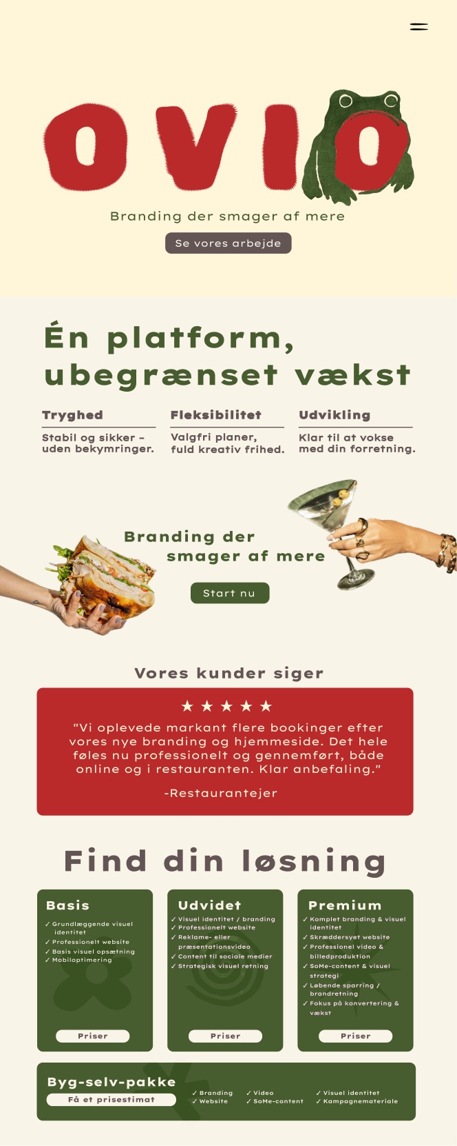
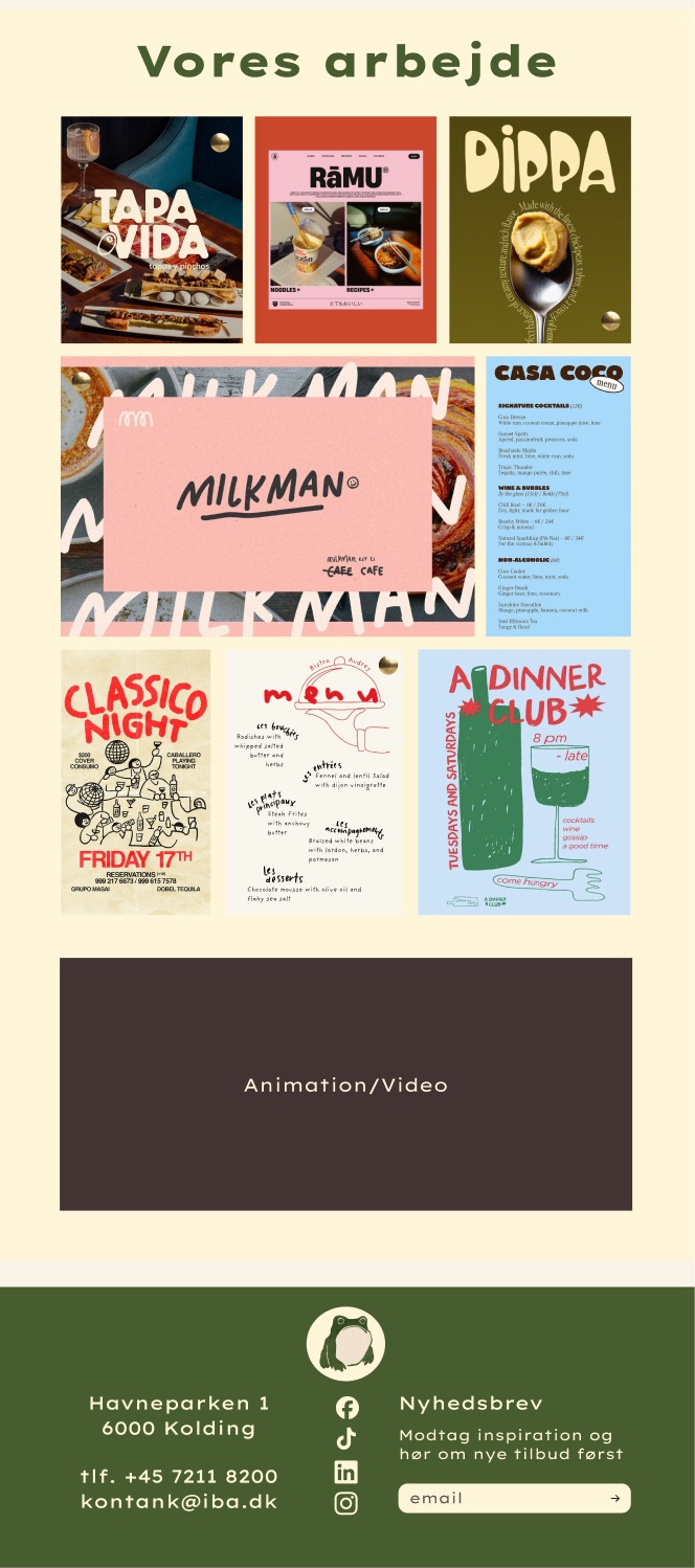
Top of the OVIO frontpage: logo, the headline “Én platform, ubegrænset vækst”, three pillars, a five-star review and the packages Basis, Udvidet and Premium. Lower part of the OVIO frontpage: the “Vores arbejde” portfolio grid with restaurant branding, menus and posters, and the green footer.

Scroll inside the window to see the whole page.

Colors

  • Vanilla cream
    #F9F4E8
  • Butter cream
    #FFF5D9
  • Olive green
    #475D2F
  • Black pepper
    #433434
  • Paprika
    #B92A2A

Typography

  • Lexend Giga
    Main font
  • Rubik Spray Paint
    Logo font
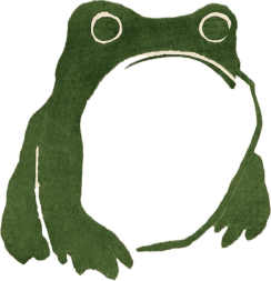
OVIO’s mascot: a green frog drawn with simple Japanese-style lines.

Do you want to read more about this case study?

Case study 01 – continued

Moodboard
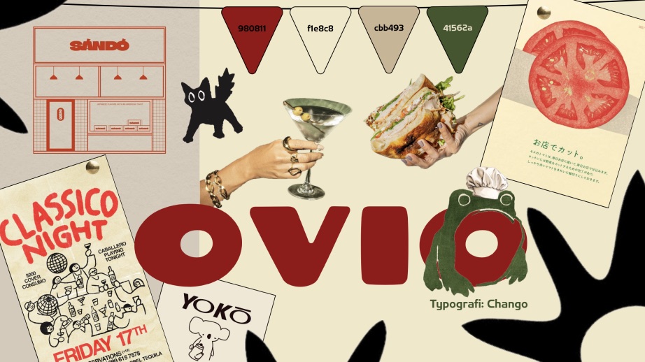
OVIO moodboard with the Sándó shop sign, a “Classico Night” poster, sketches of a black cat and the Yokō elephant, a tomato illustration and the red OVIO wordmark.

Process

Strategy to execution: communication brief and SMART goals, SWOT and value proposition, a Business Model Canvas, and a persona (a time-strapped owner/chef) to anchor design decisions.

Two testing rounds shaped the design:

  • Trunk test — confirmed first-time visitors quickly grasped the offering and pricing.
  • Desirability test — the top unprompted words were “flot”, “moderne” and “kreativ”, matching the intended identity.

SEO covered keyword placement, single-H1 structure, and internal linking across homepage, portfolio, and package pages.

Landing page & digital experience

The site translates the brand into a service-led experience for restaurant owners evaluating an agency:

  • Hero — the OVIO mark, a clear value statement, one CTA.
  • “Én platform, ubegrænset vækst” — three pillars (stability, flexibility, growth) making the case for one partner over scattered freelancers.
  • Tiered packages — Basis, Udvidet, Premium, plus a build-your-own option, for both small spots and growing multi-location brands.
  • Social proof — a five-star testimonial citing a measurable rise in bookings.
  • Portfolio grid — restaurant branding, menus, event posters, and packaging, styled as a tactile, magazine-like grid.

Built mobile-first with fast load times and a clear hierarchy, for owners evaluating agencies quickly between service and prep.

Outcome

A cohesive brand system with logo, color, type, tone, and working site, positioning a fictional agency credibly against real competitors while staying distinct through one memorable character. Testing confirmed visitors understood the offering within seconds, in the terms the brand aimed for.

Next steps: deeper technical SEO and testing with real restaurant owners.

Moodboard & references

Before the identity was locked, the moodboard gathered OVIO's raw influences: retro café signage, hand-drawn characters, tactile food photography, and Japanese print design — a feeling board more than a style guide, built around a shared warmth and playfulness.

Vintage shopfront signage (like “Sándó”) shaped the confident, slightly worn typography, while sketches like the black cat and “Yokō” elephant pointed toward a single illustrated mascot — the seed of OVIO's frog. Japanese packaging and editorial layouts, seen in the tomato illustration, reinforced the simple linework and generous white space of the final logo.

An early four-colour test (deep red, warm cream, dusty tan, muted olive) set the palette's temperature before refining into Vanilla cream, Butter cream, Olive green, and Paprika. Chango was tested here, but Rubik Spray Paint was chosen for OVIO’s logo for its unique character.

The final OVIO logo in red with the green frog on the letter O.
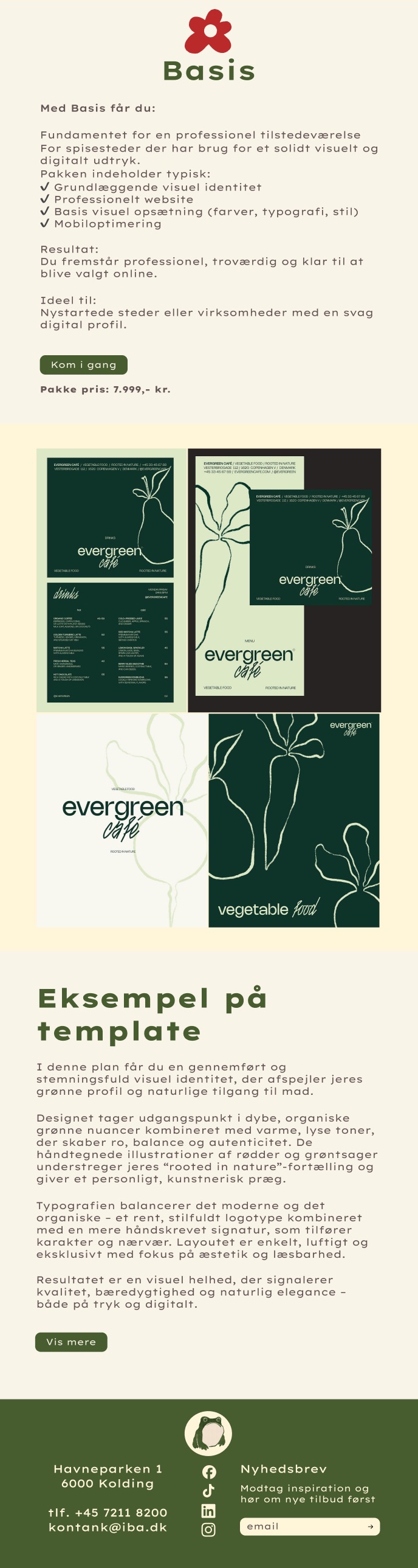
Package page: Basis
OVIO package page “Basis”: what the package includes, who it is for, the price and an example template for a café called Evergreen.
Package page: Premium
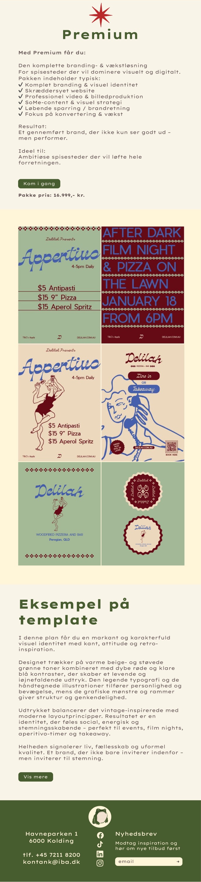
OVIO package page “Premium”: the full branding and growth package, with an example template showing “Aperitivo” and “After dark film night” posters.