Case study 02

Garn & Craft

A digital and visual concept redesign for a Kolding-based yarn and craft store, moving from yarn boutique to creative community.

Overview

Garn & Craft is a physical yarn and craft store in Kolding with an existing webshop, specializing in certified quality yarn, tools, and in-store workshops. The project set out to redesign its digital presence and visual identity so the brand could reach a wider audience — particularly younger, digitally native crafters — without losing the loyal, older customer base that has supported the shop for years.

The result is a refreshed brand system and a mobile-first website that repositions Garn & Craft as a creative community, not just a yarn retailer.

Team
Solo project
Role
Research
UX / UI designer
Web designer
Subject
Rebranding, web design
Year
2025

Tools used:

  • Figma
  • Canva
  • HTML
  • CSS
  • GitHub
  • ChatGPT

Colors

  • Sand
    #FFF8F2
  • Cacao
    #40312E
  • Rain blue
    #6C7E95
  • Olive green
    #849060
  • Dusty rose
    #D5ACAD

Typography

  • Merriweather Sans
    H1, H2, H3
  • Roboto
    Body text
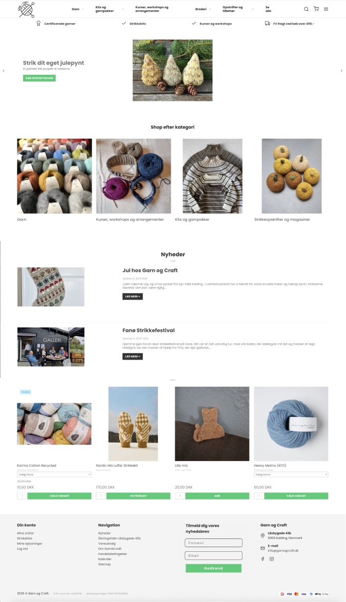
Current website
Screenshots of the current Garn & Craft website: a plain webshop layout with photos of yarn.
Current logo
The current logo: a round yarn ball with knitting needles.
New logo suggestion
The new logo suggestion: a heart-shaped yarn ball drawn with fine lines.
Suggested website design
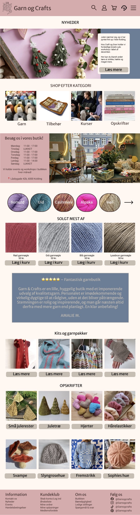
Suggested frontpage: news and events, shop by category, a yarn type selector, best sellers, reviews, kits and recipes, and a dusty rose footer.

Scroll inside the window to see the whole page.
Do you want to read more about this case study?

Case study 02 – continued

The challenge

The existing website didn't reflect the warmth or the creative energy of the physical shop, and it wasn't intuitive enough to support the business's ambition to grow. The core challenge was a generational one: how do you modernize a brand enough to resonate with 18–39-year-old crafters active on TikTok and Instagram, while keeping the experience familiar, calm, and trustworthy for the existing 40–70-year-old customer base who value quality, craftsmanship, and in-person connection over trend-driven design?

The brief called for a digital hub that could support both audiences: webshop, workshops, certified yarn, recipes and tutorials, and community features, all built around a single, coherent visual identity.

Research & personas

The project began with desk research, trend data and statistics from sources like Danmarks Statistik to understand the growing interest in craft as a hobby, especially among younger demographics. This was layered with a Design Thinking process: problem framing, ideation, wireframes, and hi-fi prototypes, refined through user feedback at each stage.

Two personas anchored every design decision:

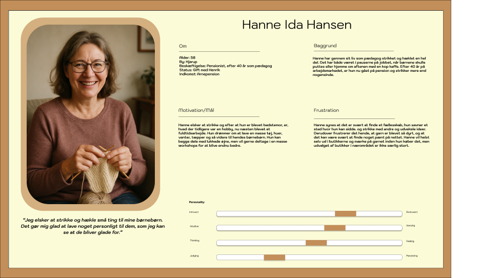
  • Hanne Ida Hansen, 58 — a retired pedagogue from Hjarup who has knitted her whole life and now treats it as a near full-time creative pursuit. She wants community and workshops but is frustrated by high yarn prices, a limited local selection, and a strong preference for shopping in person rather than online.
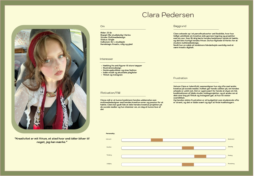
  • Clara Pedersen, 23 — a multimedia design student in Herlev who learned to crochet from her grandmother at 16. Craft is her creative outlet, but she often compares her work to others on social media and struggles to find quality yarn on a student budget.

A SWOT analysis, a 7Ps marketing review, and a TOWS matrix rounded out the strategic groundwork, identifying community-building, certified yarn, and the owner's background in craft psychology as the brand's strongest differentiators against six competing yarn shops in Kolding.

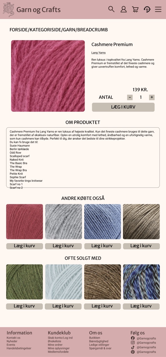
Product page
Product page for Cashmere Premium yarn with price, quantity, an “add to basket” button and recommendations.
Contact & find us page
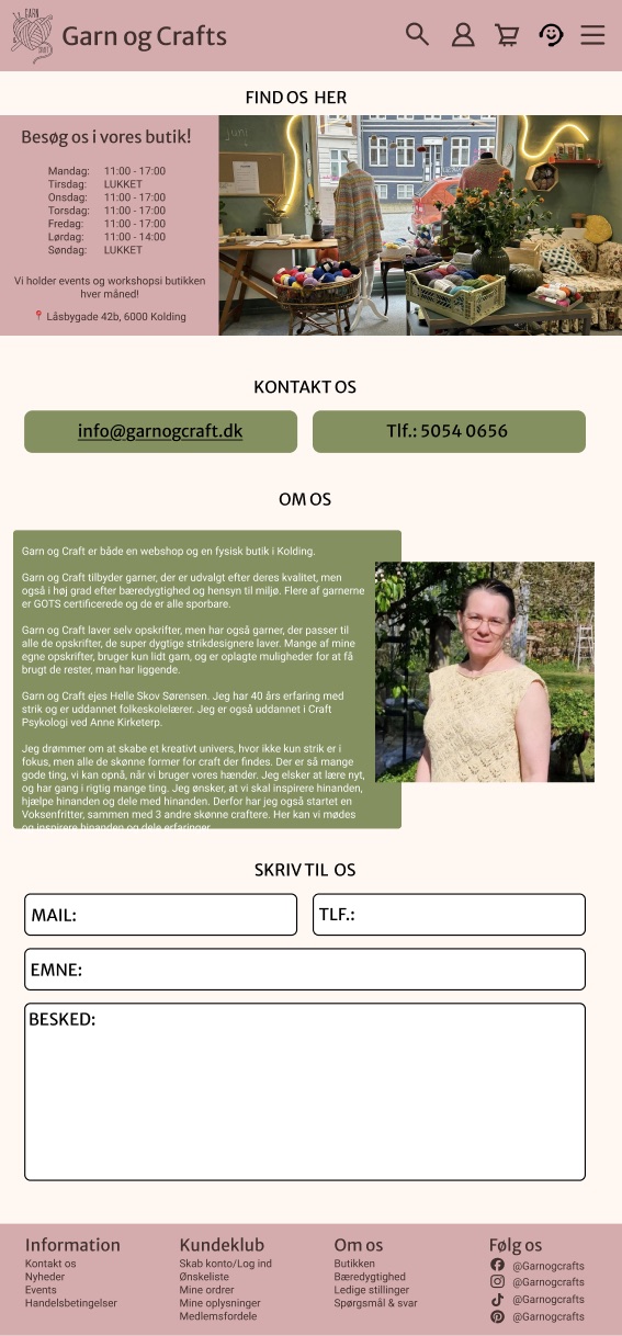
Contact page with opening hours, the shop address in Kolding, a note from the owner and a contact form.
Moodboard
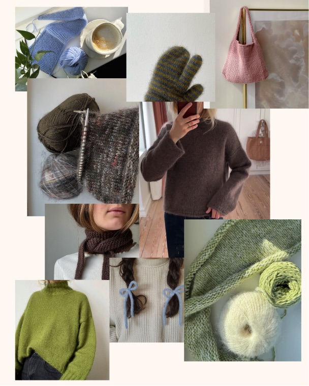
Moodboard: knitted jumpers in brown and green, a striped mitten, a pink knitted bag, yarn balls and blue bows in braided hair.
Mobile wireframe
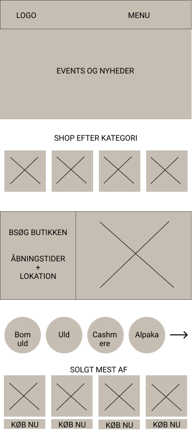
Simple mobile wireframe of the frontpage: logo and menu, events, shop by category, best sellers, reviews and recipes.
Persona: Hanne Ida Hansen, 58
Persona card for Hanne Ida Hansen with a photo, background, motivations, frustrations and personality scales.
Persona: Clara Pedersen, 23
Persona card for Clara Pedersen with a photo, background, interests and personality scales.

Outcome

The result is a cohesive redesign with a new logo, calmer color system and a mobile-first website that repositions Garn & Craft as a creative community spanning two generations of crafters.

Built on Gestalt principles and CRAP (Contrast, Repetition, Alignment, Proximity), the site keeps a content-dense retail experience calm and easy to scan: related content is grouped tightly, product cards follow one consistent pattern, and generous whitespace keeps focus on the photography rather than the UI. Repeating layouts, distinct CTAs like “add to basket” and a predictable top bar (search, profile, cart) build recognizability throughout.

This carries through the full experience: a homepage combining a hero banner, shop-by-category grid, and a fiber-type selector doubling as a visual index; filterable category pages for quick browsing; product pages that keep the purchase action front and center; and a contact page pairing practical info with a personal note from the shop's owner. Testimonials, a “sold most often” module, and a kits-and-recipes section add social proof and give newer crafters an easy way in.

User testing validated the emotional core of the brand: warm, inspiring, professional, while surfacing concrete usability fixes that were folded back into the final design.